Optimizing viewing and rating content details

Project Overview
Problem:
Finding and rating content wasn’t connected across the system for easy, consistent interactions.
Solution:
I embarked on an updated design where the content details screen was not only connected to the Activity Feed for users to view and rate content but also the Discover screen where users are more likely to find more content to interact with than the Activity Feed.
Impact:
This was version 1.1 in RecSpot’s biggest update since launch
My Role:
Lead designer
Team:
The Founder, Ian O’Brien, Engineering, Tejasw Gupta
Project Details
In RecSpot, the goal is for users to either rate a show or movie they just watched or find helpful information about it, such as a synopsis on Stranger Things 3, along with reviews from other users, in order to decide if they should watch said show, movie or visit a place.
Content details are an important feature to optimize because not only do friends influence buying and viewing decisions, online reviews do as well. RecSpot has the potential to become a curated reviews hub by making reviews it’s own immersive experience that offers users a quicker way to decide what to watch, where to eat and rate when they do so.
Our high level goals were:
Connect the media and places content details screens to Discover to make viewing and rating more content easier
Encourage users to rate by providing a more immersive experience that includes videos, reviews and easier rating actions.
Slimming down and redirecting information hierarchy
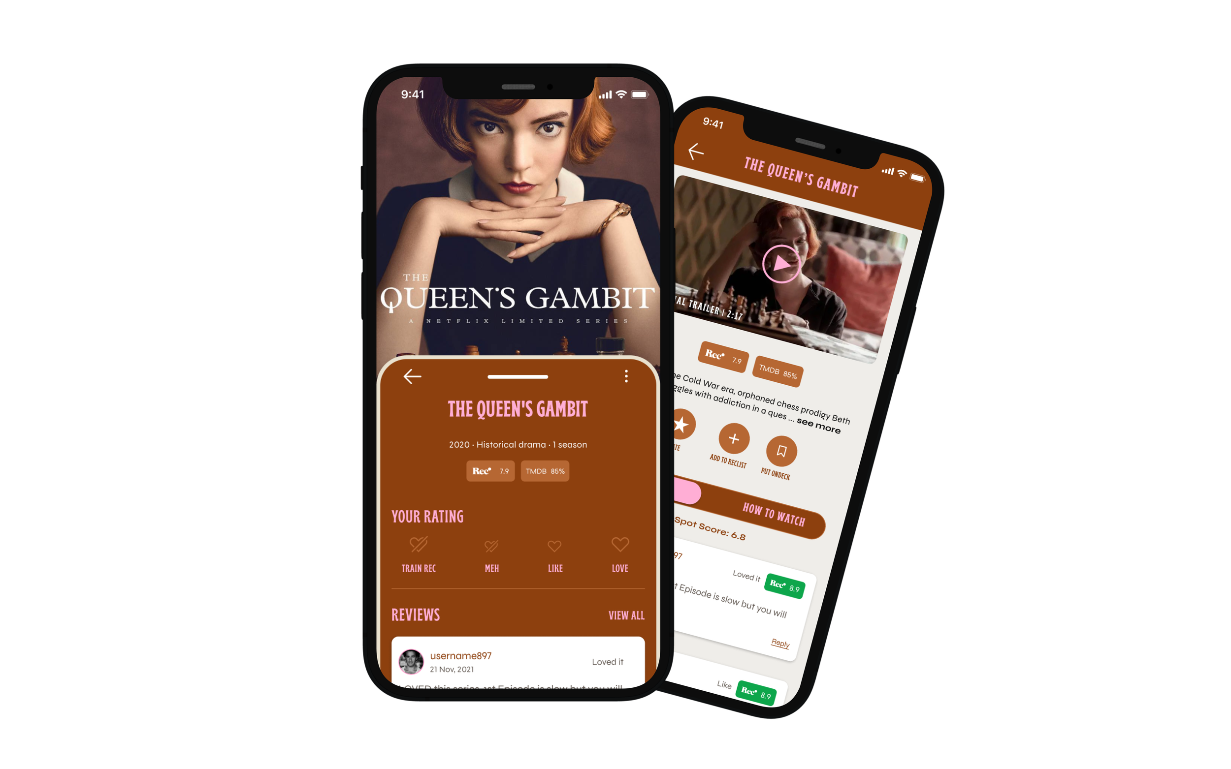
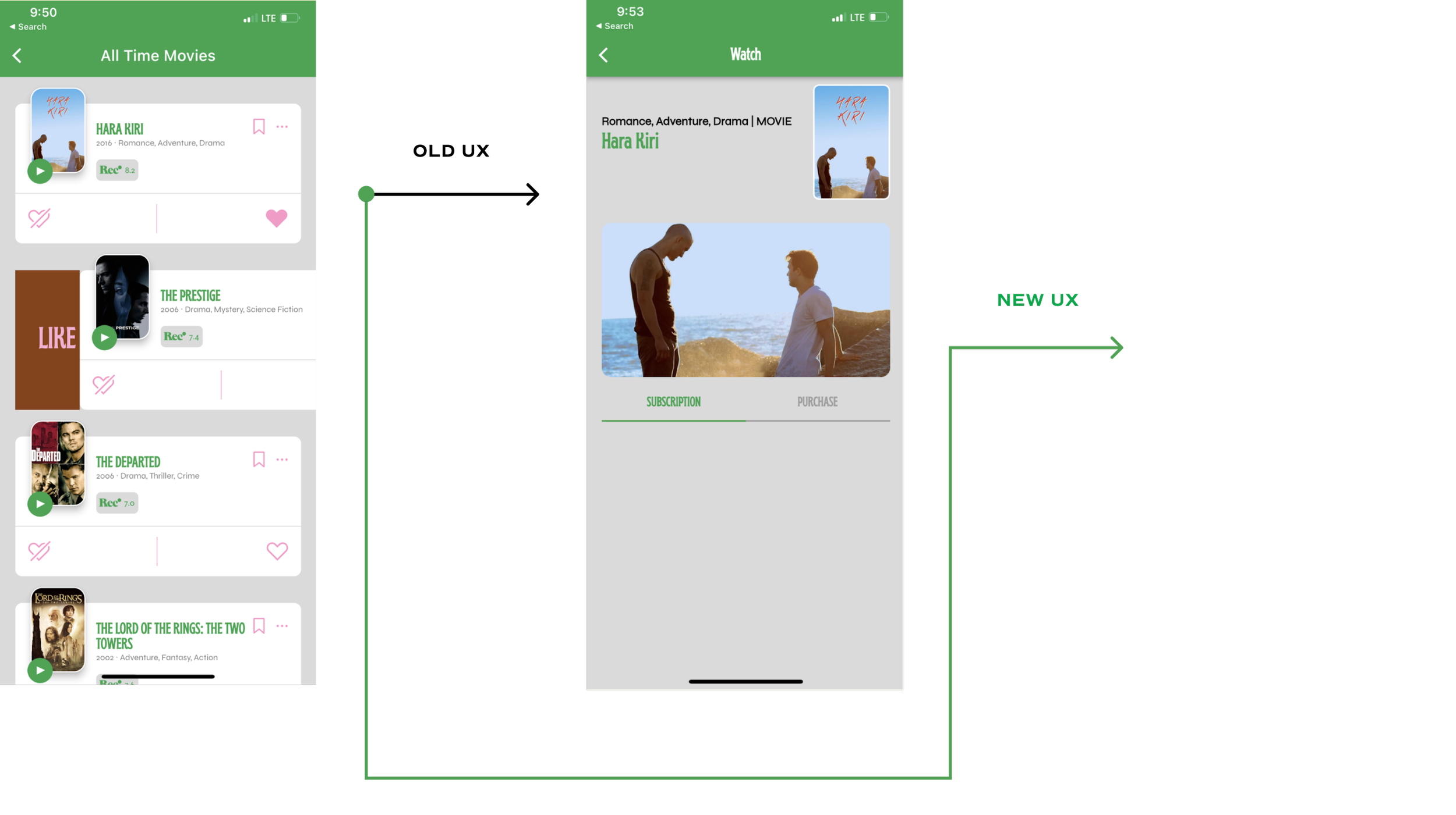
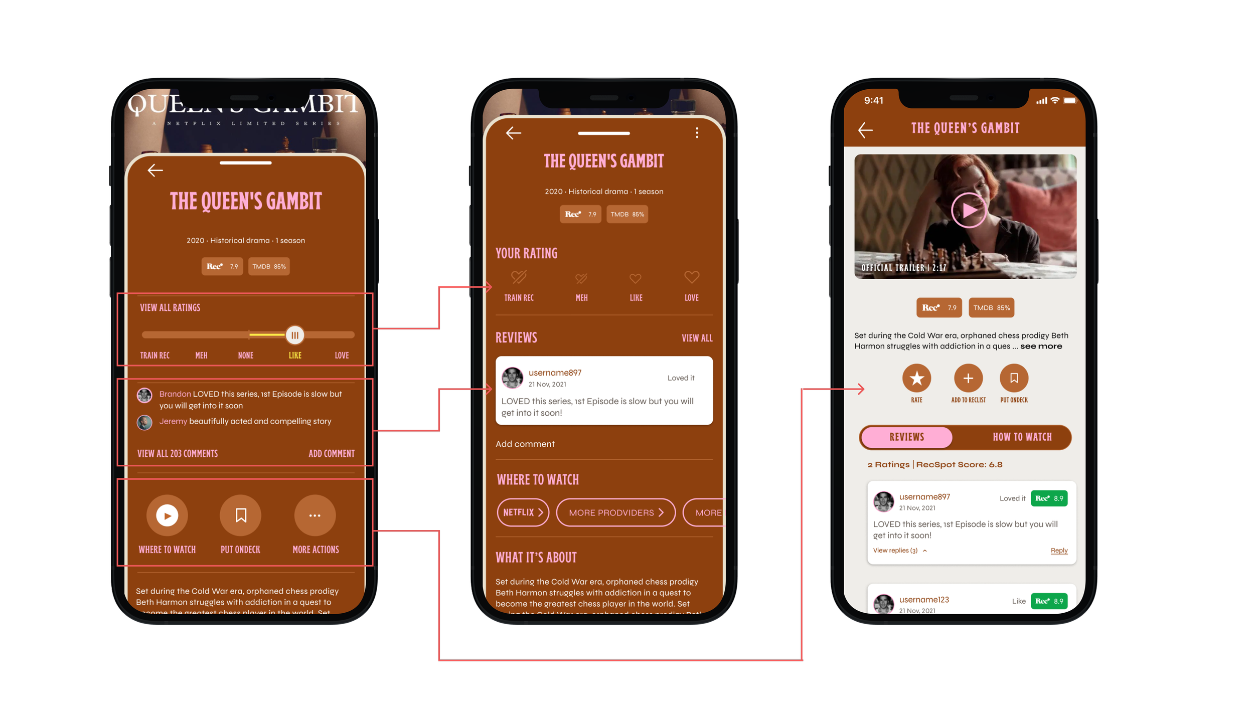
The first thing to tackle was fixing the task flow of Discover where users tap on content to view its details. It was mostly blank or had little information about the selected media. This task needed to be similar to the Activity Feed where no matter a user clicks on a movie poster within the app, the user can see its content details.
The second thing to tackle was how to better organize content hierarchy for users to view information about the next show, movie or place they want to see or review. Information we had to restructure included:
Ratings (Viewing and making your own ratings)
Content Info (such as they synopsis, who’s in the show or what’s on the menu and similar content, how to watch)
Comments (Viewing and adding comments)
UX Challenge
User Interviews
I was able to speak to a five users about their expectations and listen to requests for the content details screens. In addition to also mentioning the disconnect from Discover’s content to seeing content details, insights I found were:
Trailers and reviews should be together to quickly add your own
Where to watch a show or movie should be highly discoverable in content details
Research
Thinking of a movie theatre, IRL
Going over the user interview notes, I found the idea of a trailer of a movie and comments together to be really insightful. It led me to think of an experience like a movie theatre. You can watch the trailer and read the reviews similar to how in a movie theatre that is (potentially) packed, you can hear what people think of the 30-60 second preview of the next Marvel movie, hear their laughter and either agree or disagree.
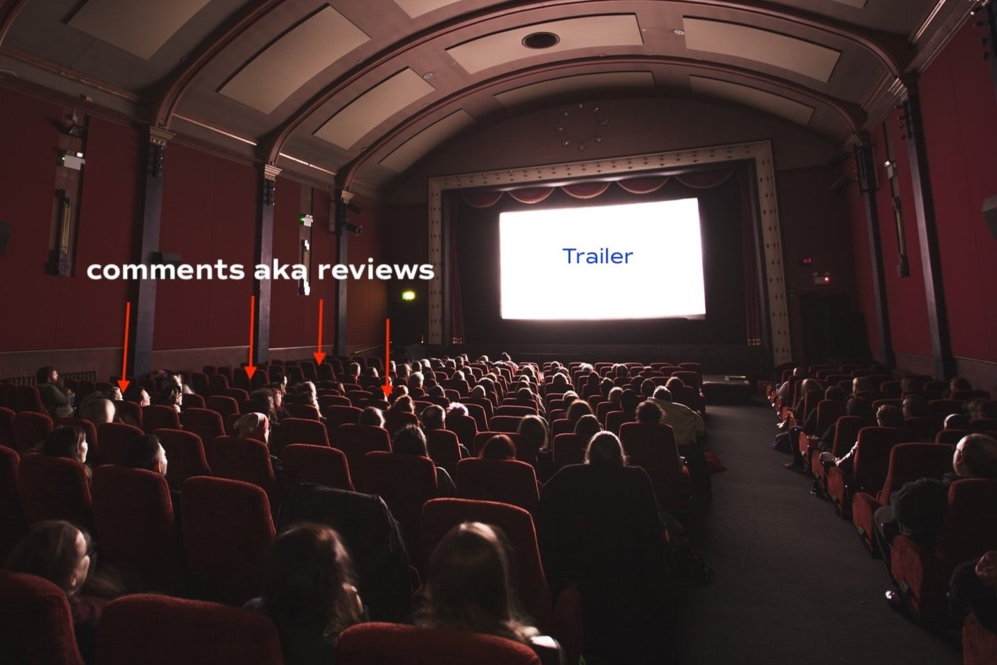
In order to achieve a digital movie theatre, I condensed the content details from two screens to one for both to be easily visible and actionable. Then, I imagined an experience where users can watch a trailer virtually together and read or post reviews. My goal was to create a immersive experience when watching a trailer with actions sprinkled in for users to rate, save to a RecList or send to a friend.

Streamline content and commentary
UX Solution
Users needed an easier way to view content details, watch the trailer and leave a review.
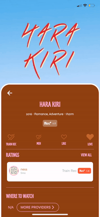
Rating became a simple tap and easier to understand visually. Instead of sliding, which can also hinder accessibility, a user can rate something a Train Rec, Meh, Like or Love much easier.
Comments are much more visible with a frame, the user’s own comment will be the prominent view
Where to Watch and streaming providers became much more visible
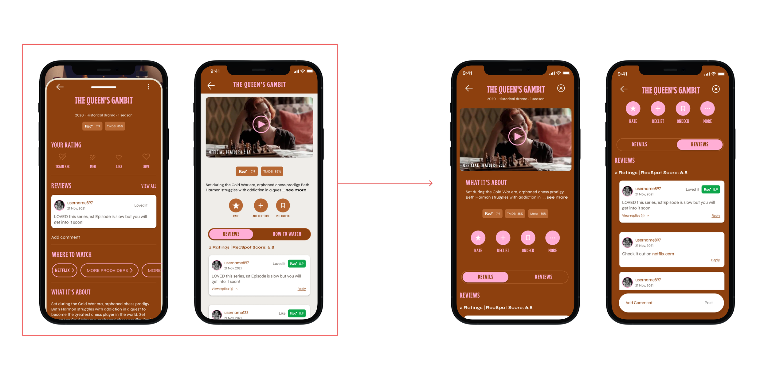
When viewing the trailer, the user had another option to rate and leave a review which is encouraged by viewing other users reviews
When finding the review screen from the Play button, the user can also see where to watch, similar to if they found the content details screen from clicking on the poster or title of the content
Ideation Part One
The remixed view
On the second iteration, we decided to make clicking content details even easier where both the trailer and details copy can be viewed in one click, with no need to click between a poster or a play button. Just click and swipe for the content you want to see.
Ideation Part Two
The slimmed down view
The Add comment button was a harder than realized design to implement. In order to have a comment button that was easier to implement and for the user to see and tap, I updated it to stick at the bottom rather than float. As of writing, this update is still being implemented.
Ideation Part Three
Adding comments
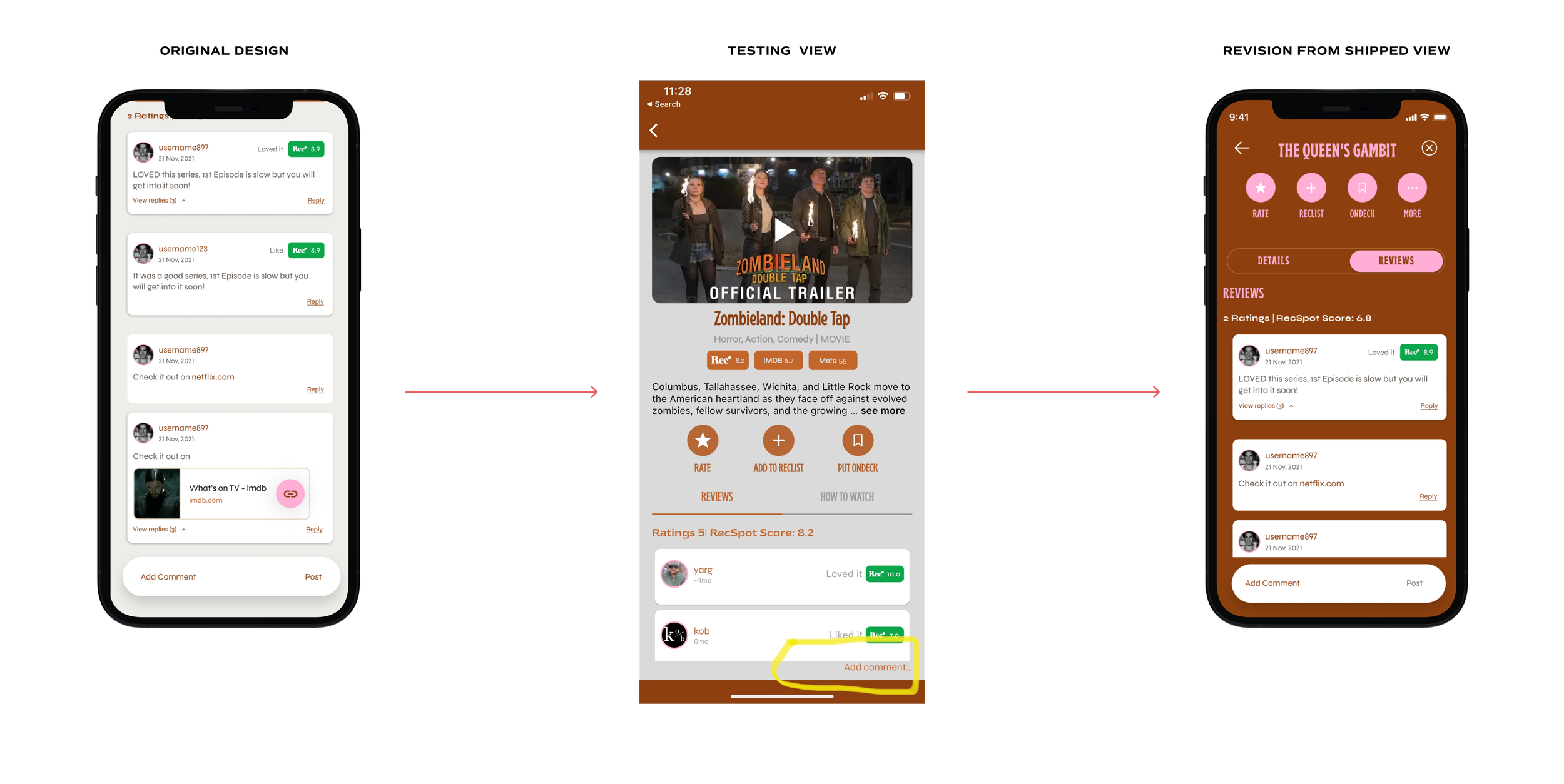
The biggest challenge was learning to be ok with where designs are once the are pushed to ship and over communicate what needs to be done in order to continuously improve the experience for users. Until weeks had passed, I was not privy to the engineering effort it look for the “Add Comment” button to appear at the correct position at the bottom of the screen.
After reviewing the product app and seeing updates weren’t made because of the effort needed, I redesigned the “Add Comment” section for easier implementation (it was harder to see and tap at the bottom of the screen). It turned out to be our longest sprint to date. In the future, I will make greater effort at negotiating my reach across the aisle even if it’s something that a stakeholder isn’t used to, for the betterment of the user’s experience.
In the end, I am proud of the updates we made to make the content details screen more immersive and hopefully more enjoyable for users. This was a lesson in reaching “good enough” but learning how to communicate to reach “great” which I have already made improvements on after this project.
Outcomes