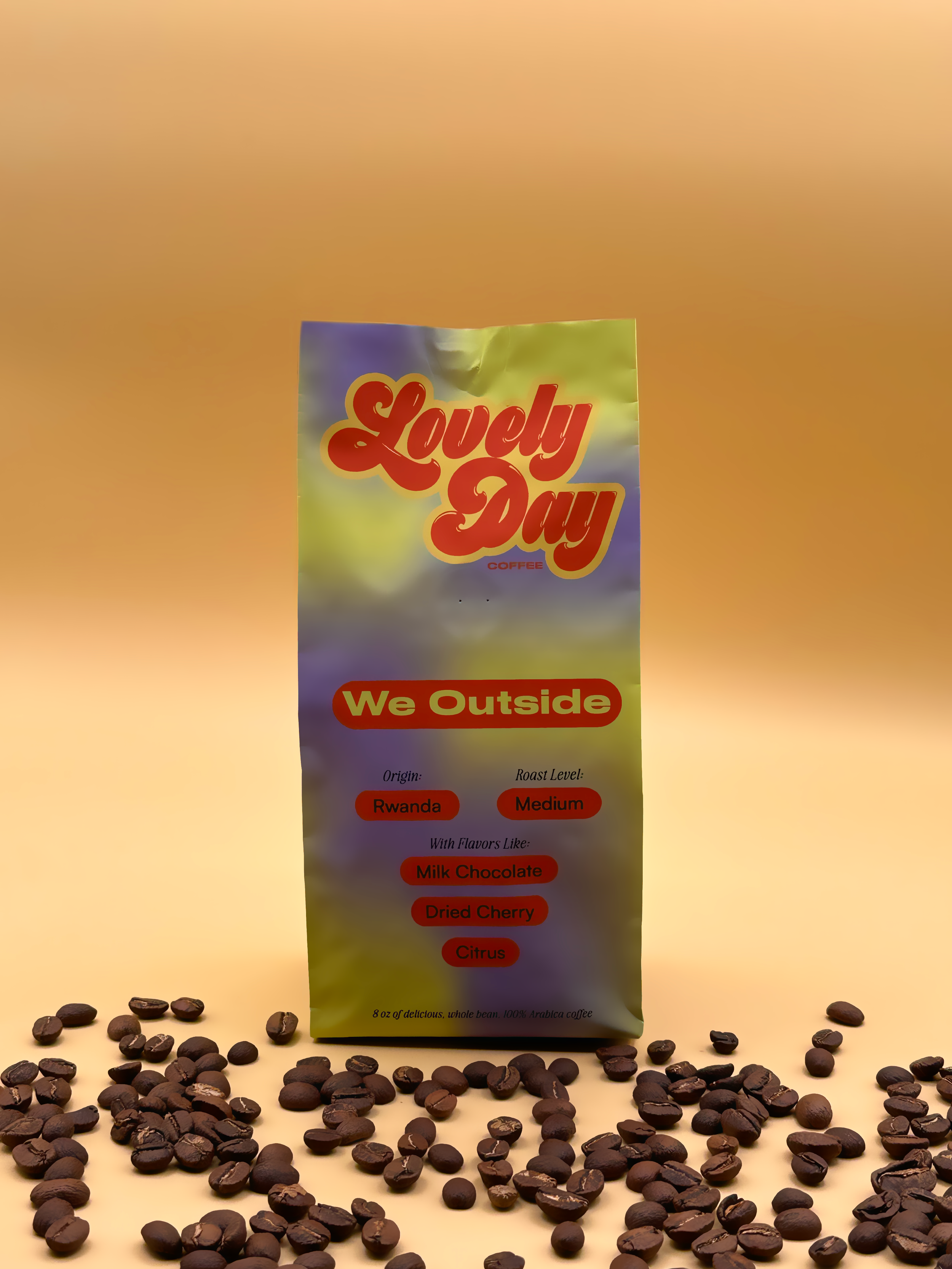
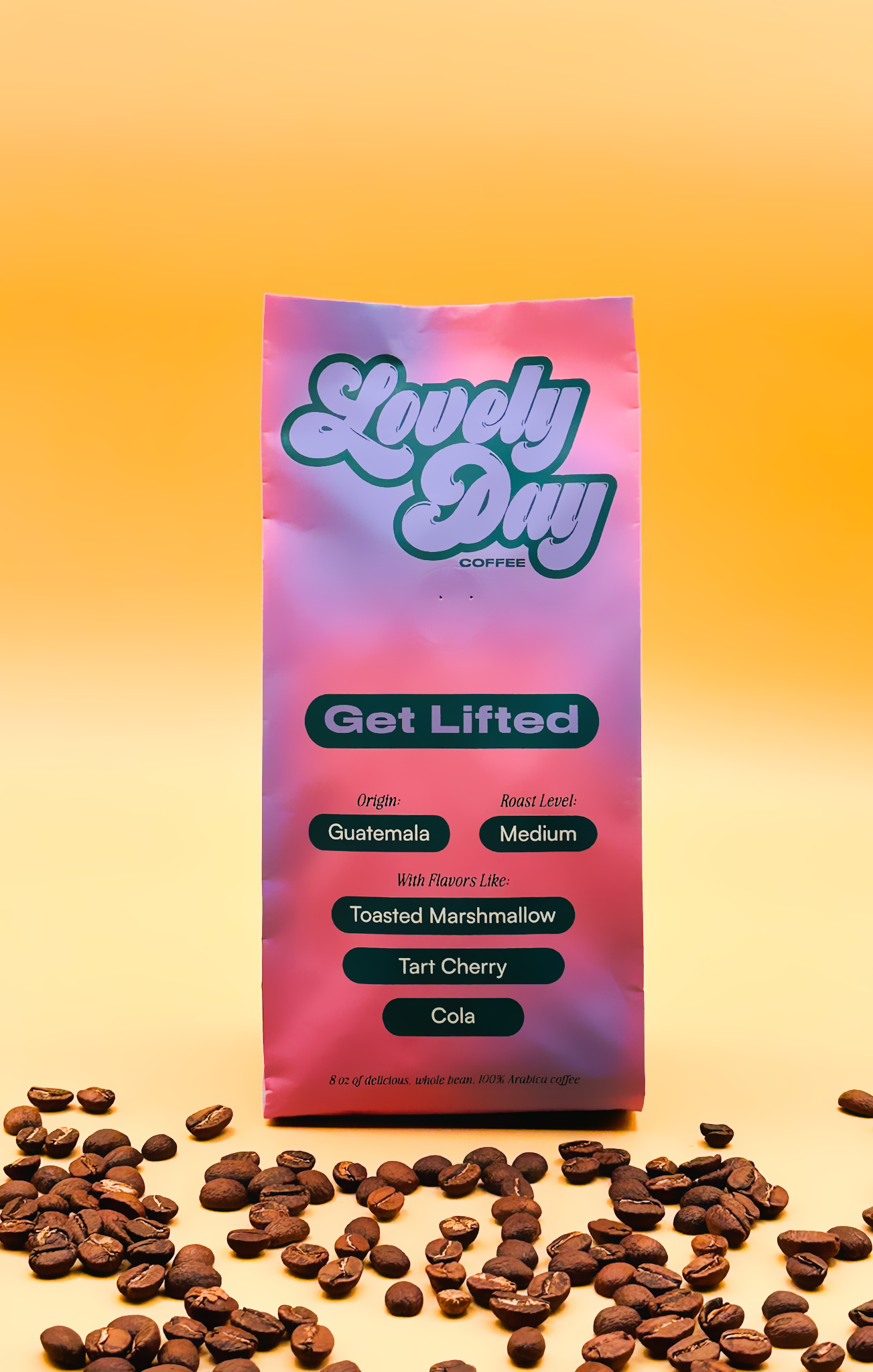
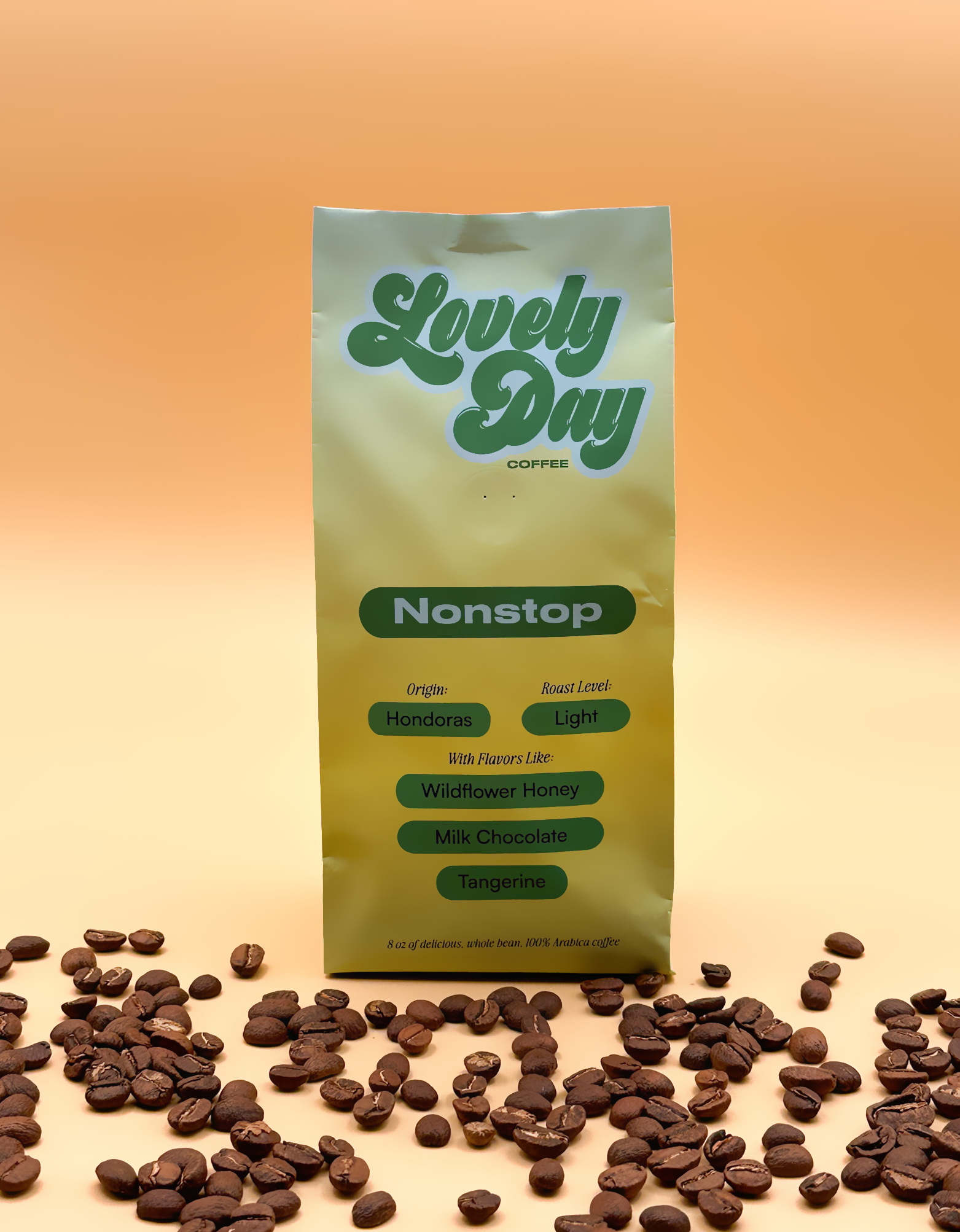
Full-on design for Lovely Day Coffee—a new kind of coffee company inspired by the late nineties and early aughts.
I created the look and feel from branding, packaging to art direction and web. Inspiration was taken from the playfullness of 90s to 2000s culture and the nostalgia cravings of today.
Naming and Identity
The name Lovely Day Coffee was chosen as a direct rejection of coffee’s typically muted, utilitarian aesthetic. Color became the primary design tool, creating a visual language warm enough to make any day feel like one.
Gradients for each coffee origin were selected to give each a distinctive personality that can be built upon. The blending of gradients also symbolizes lightness and optimism, bringing excitement to the design. This approach ensures the bags stand out, whether on a store shelf or a countertop at home.
Typography and Color
As a direct anti feeling to the masculine and rigid nature of coffee branding, I wanted to create a system that was flexible with a mix of soft and hard elements. For the type, I used a vintage style in Awesome Serif and mixed it with the commanding, yet approachable style of Druk Wide. Adding the typefaces with different color schemes, the brand feels flexible, recognizable, fun, and inviting.

More coming soon!
Shaping design with color, youth and craft.
Contact
michelle@michelle-carroll.com
Location
📍Remote and Kansas City
Links
Resume