
User Experience Redesign
RecSpot is a social recommendation app for friends to share recs across movies, tv shows, and places. Created from the theory that people are more likely to trust recommendations from friends rather than strangers (such as a popular food critic), RecSpot wants to be that all-in-one social rec stop because, who knows you better than your friends?

Problem:
Basing the app off of the above theory wasn’t working well enough for us, though. We noticed retention dipped each month and after conducting a UX audit, I concluded that discoverability and learnability were failing our users.
Assumption for key improvements needed:
Core features that did not match similar social platforms, making it harder for users to learn and recall new information about the app.
Each feature has unusual naming, putting more cognitive load on the user, plus other interaction issues. These may be causing the users to leave the app and not return.
Solution:
Simplifying feature locations and provide just in time help for names of categories to foster a useful experience.
Impact:
This turned out to be RecSpot’s biggest update since its launch.
My Role:
I was the lead designer of creating an enhanced user profile and community. I reported directly to the founder.
Key deliverables I worked on:
Restructure the UX of and rebrand the community feature to MySpot
Update profile UX when viewing someone else’s or your own
Update the visual design, including changing the color palette for 30 screens, the visual aesthetic of tabbed sections
Update the look and feel of a RecList summary from an unintuitive circle to a horizontal scrolling list
Team:
The founder, Ian O’Brien guided me and provided requirements. He handed off the designs to engineering with notes in Jira.
Duration:
Two months
Overview

Notes from the founder on what needed to be redesigned. Some things are purposefully omitted.
Our goals of the project were to make the core features of the app easier to use by reducing the difficulty of wayfinding, tracking media and places loved, saved, and hated in MySpot, RecLists and Profile.
High Level Goals Were To:
Simplify finding things to rate and where they are housed
Reduce the effort it takes for users to learn the interface
Create a space that encourages engagement and sharing between friends
UX Challenges
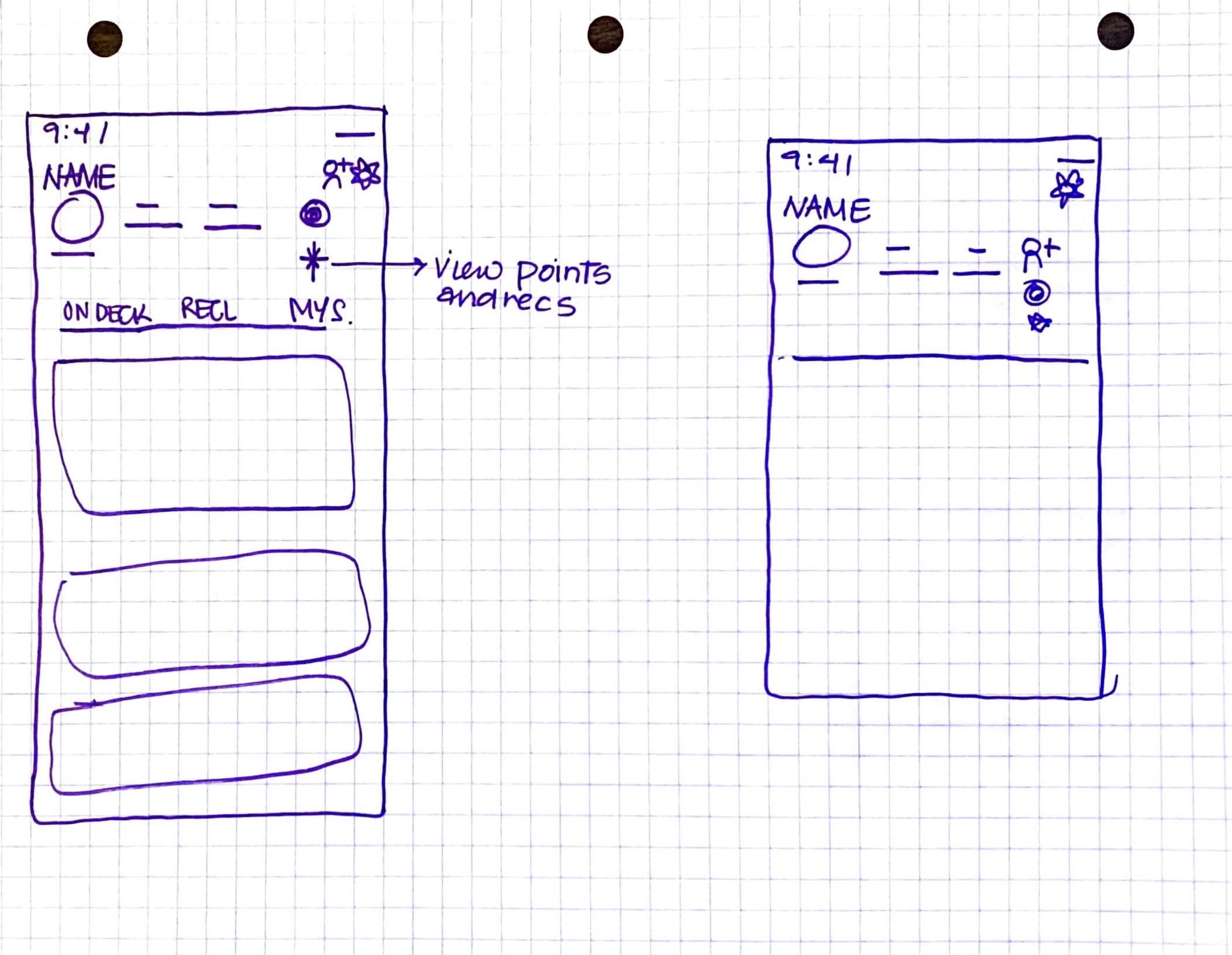
Profile Screen Redesign Sketch
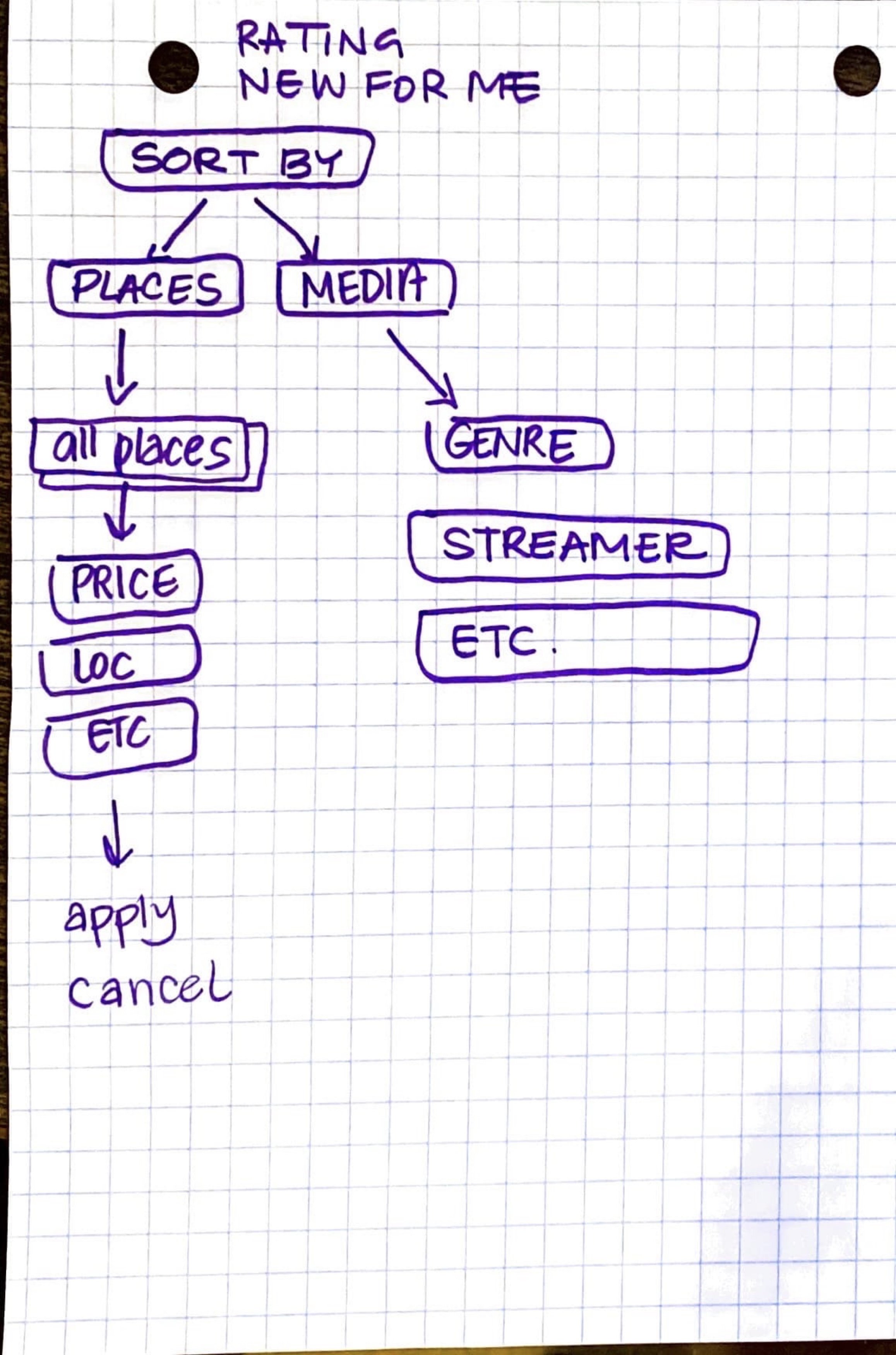
Ratings Filter for Users to Sort
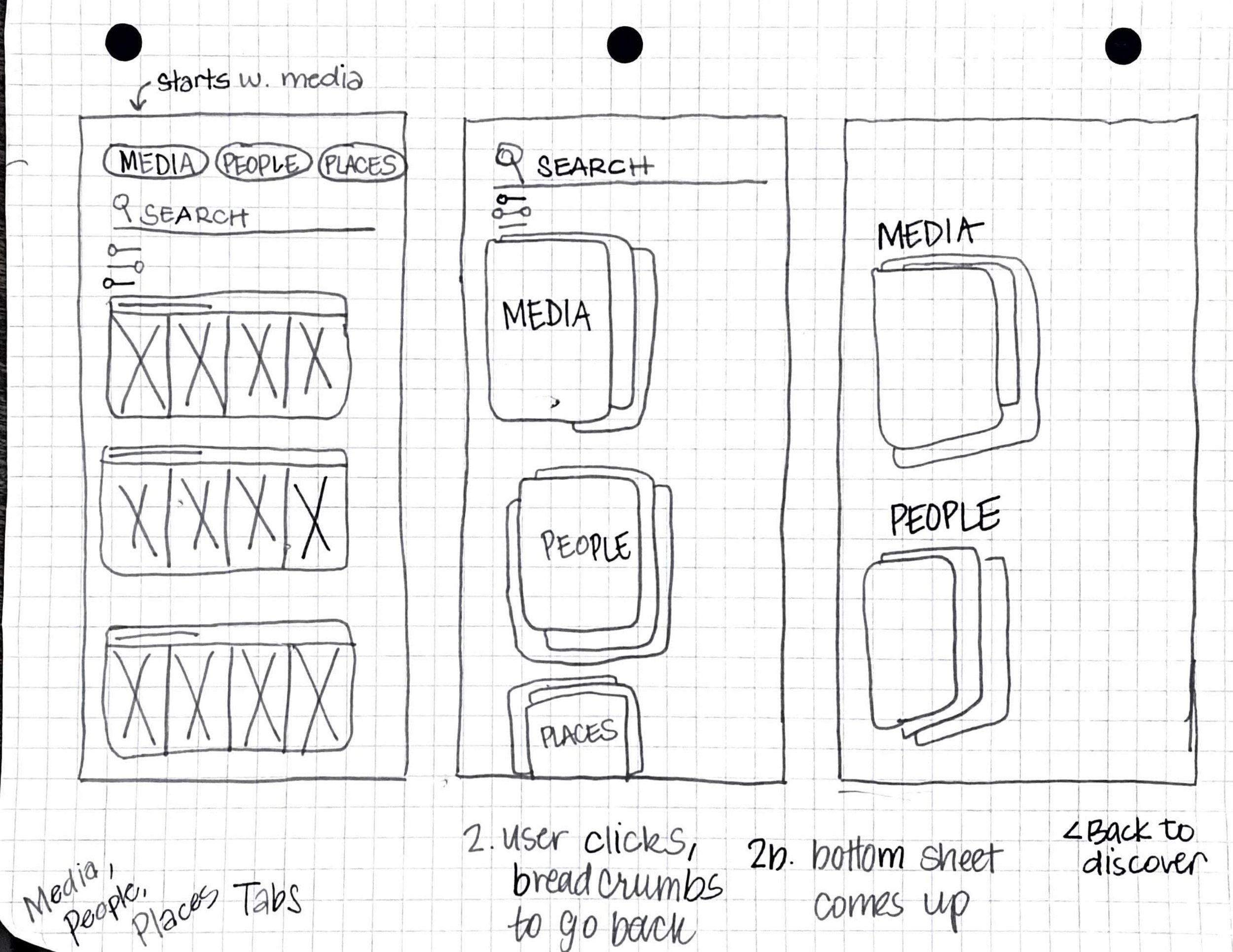
Discover Screen New Tabs Sketches
We unfortunately don’t have budget for doing usability testing often and there was a small timeframe to push the update. I had to do a lot of brainstorming and thought putting myself in the users shoes was the best way to find a new solution.
The principle I came across to implement was the Organizing Principle framework, it helps to better understand the need behind each category and how each category, once grouped together by meaning and function, will help the users reach their goals.
Three primary questions were brought to life by using this principle:
1). How can this redesign make the user’s experience more enjoyable?
2). Will this redesign keep users coming back and invest their time to complete actions?
3). Can this encourage the user to rate content and share from within the app?

To decide the apps' organizing principle, in lieu of usability testing and building from a persona, I used the JTBD framework to dig deeper into why our user base would want to “hire” the app for rating content and creating RecLists.
This framework was impactful because although we have an initial target audience of those who are social and like to share what they’re into, pretty much everyone enjoys some form of media (TV, movies) and places (restaurants, cafes, theaters) so focusing on a persona could leave those out who don’t fit within predefined traits of being social online or having many friends.
To make the experience of sharing and documenting favorite content easier, our top jobs to be done were:
Make it simpler to find content they recently watched to rate and want to watch in features that aren’t redundant
Create a running list of content across core categories (media, places) to refer back to
Share content, reviews and lists mainly with friends and probably strangers (i.e. like-minded reviewers)
Breaking Down the Feature Friction
The Discovery
Being Hired By Our Users
The Jobs to Be Done (JTBD)
From our audit and JTBD framework we found:

Profile - Viewing your own
Profile was overly complicated with three different sections to navigate. In other social media platforms, users usually only see their images or messages with remaining features hidden under secondary navigations. To solve for this, we left only the most important thing for users to see, which is all the content they interacted with in forms of bookmarking or sending.

Profile - Moving the main hub to MySpot
We moved OnDeck, RecLists out of the user’s profile page and into the community which was rebranded MySpot. “Sent” stayed in MySpot and became more visible on the first layer of navigation. Removing it from “viewing your own profile” helps to build the mental model of these catgories are what is to be shared with other users and friends.

Profile - Viewing other users
When viewing someone else’s profile, we updated the tabs and made it more obvious if a new user hasn’t interacted with content yet by stating “Nothing Archived Yet.” We also encourage the user to share their RecLists by going to their lists screen with a tap. Previously, there was no CTA.

Recs to RecLists screen
For users, the information architecture under Recs was the hardest to understand and navigate. In a previous usability study, users also had a hard time figuring out the meaning of each nested tab. Our first iteration launched a slimmed down, easier to navigate tabs. We were thinking of testing reactions actions to RecLists to increase engagement, but it is shelved for the time being.

RecLists Screen
The circular shape of the RecList cards didn’t clearly indicate what users had in each list and the two different colors in the circle were confusing. We made the list scrollable with each place labeled for when a user views their own profile (who can remember every name of a place?) and viewing someone else’s profile.

Messages & Notifications Screens
Messages and Notifications were buried within the community screen taking the users on a windy trip to find a DM. We moved their location to the Activity Feed, which is the home screen. The user sees if they have a message right away when they open the app. Messages and notifications are 2 less taps away.
The Launch
The launch has been live for almost two months now and we are continuing to make the functional details smoother and easier to interact with along with refining the visual design. I am pushing for an abundance of microcopy to inform users the meaning of each section until RecSpot is used more widely and its language is familiar to a wider array of users.
MySpot redesign instructional video for new users.
Being the sole designer on this project was daunting and invigorating at the same time. I was also affected by the cognitive overload from trying to understand the meaning behind each category myself as the redesign took place within the first couple of months of me joining, where there is so much to learn in general. I executed the design from end-to-end with ambiguous requirements, input and support from Ian. Needless to say, I learned a lot about a business and user’s requirements and how to successfully work remotely with new people, fast.
This project taught me the value of digging deep into user frustrations and how that can really affect your app’s performance in terms of retention and churn. It also taught me there’s an art to giving recommendations for improvements, them not totally being received and implemented when they should be, and negotiating what tasks should be done when and for how long. I’m definitely learning how to paint.
Next steps are to increase learnability by including helpful microcopy that explains the meaning behind the titles and let it linger until the user base is large and feature names become familiar. We can be different, but not too different to our detriment. I also want to push again for usability testing, I think it’s important when you hear from the horse’s mouth what’s wrong, a designer’s voice can sometimes be just an echo.
Outcomes
A good start with much more work to do
Shaping design with color, youth and craft.
Contact
michelle@michelle-carroll.com
Location
📍Remote and Kansas City
Links
Resume